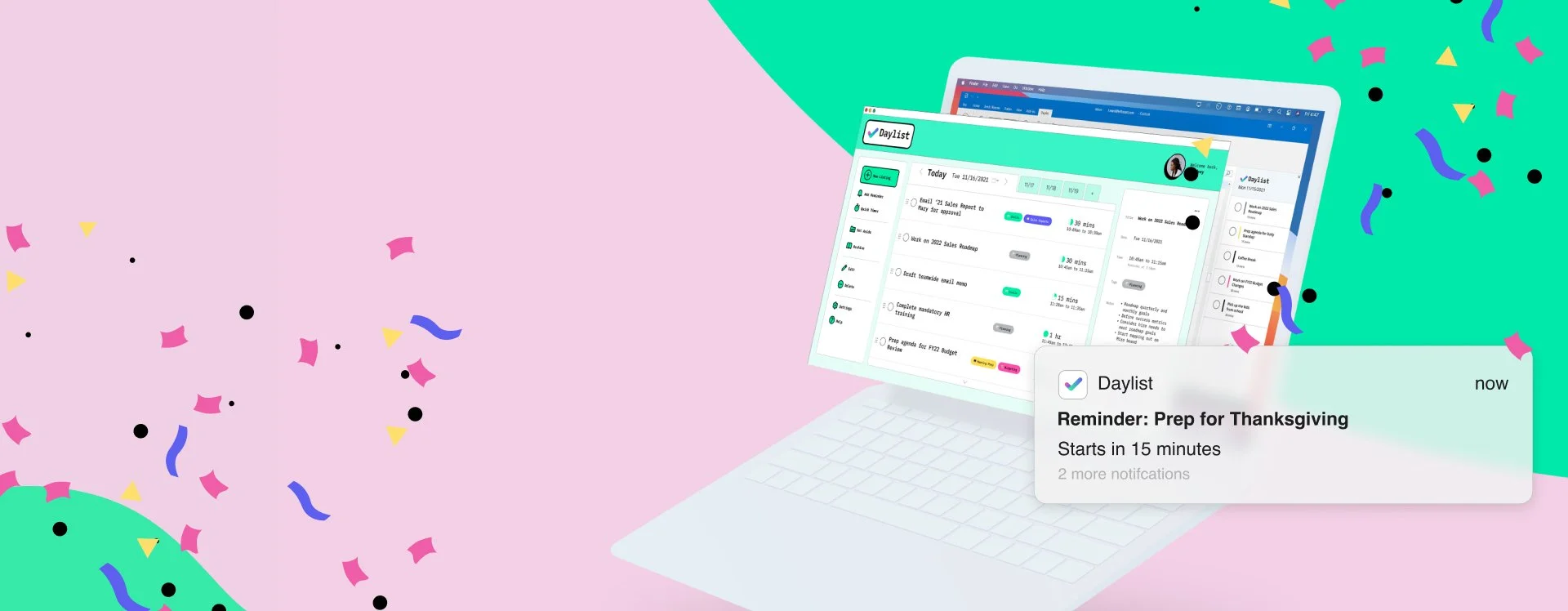
Daylist
Your smart to-do list, marrying list-making with time management methods.
Some Context
Roles & Contributions:
Project manager, Interviewer, Information Architect , Sketch Artist, Presentation Content Writer
Fellow Collaborators:
Mateo Nava: Design Lead
Heidi Given: Research Lead
Sam Rapa: UX Generalist
Project Timeline:
8 weeks
Research Categories:
Generative, Evaluative
Project Type:
Group academic, Design Lab, M.P.S. UX Design, MICA
Challenge prompt set by curriculum
Faculty Advisors:
Patricia Reyna-Wright
High-Level Research Goals
Learn about how employees’ work-life balance is affected by a work from home environment.
Understand how users define their priorities, set goals, budget time, and stay on track
Design a tool that motivates users to stay on top of tasks and not stress about their daily to-do list
The Challenge
With the increase of WFH strategies, employees find themselves taking on work responsibilities in the same space that was formerly designated to personal tasks. Maintaining a work-life balance and setting boundaries requires more strict intrinsic enforcement. Employees need help keeping the stresses of work and home separated and satiated.
Problem Statement
In a world with competing priorities and obligations, how can we redesign the time management experience for individuals working from home? We aim to help remote workers achieve their personal and professional goals. In order to do so, we need to find out what motivates people and what helps them stay productive.
Scoping the Problem
To kick-off the project, the team reviewed the constraints of the project and our assumptions going into it. We then aligned on the potential target users and our hypotheses on the problems they face working from home. At the end of this stage, we had an understanding of who we needed to talk to and what we wanted to learn from them.

The User
Personas
As we started formulating potential solutions for the pain points that were unearthed from our research, the team needed to stay focused on the users’ needs and not our own wants. The user persona of Lindsey, the Teleworking List-Maker, joined our team roster. Identifying her daily goals, tasks, and emotions helped the team align on what kind of solution our users’ would need.

Lindsey
The Teleworking Listmaker
REMOTE WORKER

DATA ANALYST

MAKES DAILY TO-DO LISTS

Goals
Complete tasks in sequence to build towards larger goals
Stay on top of deadlines so she doesn’t let her team down
Re-prioritize her day when something unexpected comes up
Manage her time effectively so she doesn’t have to work late
Keep her personal appointments
Tasks
Completing a backlog of to-dos (tasks spill over from one period of time to another)
Filing reports
Responding to emails
Attending meetings
Generative Research
Desk Research

Along with user research, we had other sources of knowledge at our disposal. Five peer reviewed articles from academic journals provided us with reliable, quantitative data on the work from home culture. Independently published articles and blog posts gave us contemporary perspectives on WHF arrangements, with the added context of COVID. This diverse literature review gave us an idea of how we might dig deeper with our questioning.
Risk Mitigation Strategy

Before jumping into the project, the team came together to create a risk mitigation strategy. We identified risks that threatened the success of the project, how to avoid them, and how to course correct. Coming together to strategize against risks unified the team and made individual teammate expectations and fears known.
User Surveys
A ten minute survey was prepared by Heidi, our Research Lead, and reviewed by the team before being shared out with our network. At this time we were looking for quantitative information on WFH users’ motivation strategies and technology habits. We received 78 results that bolstered the validity of our desk research and user interview findings, later on.
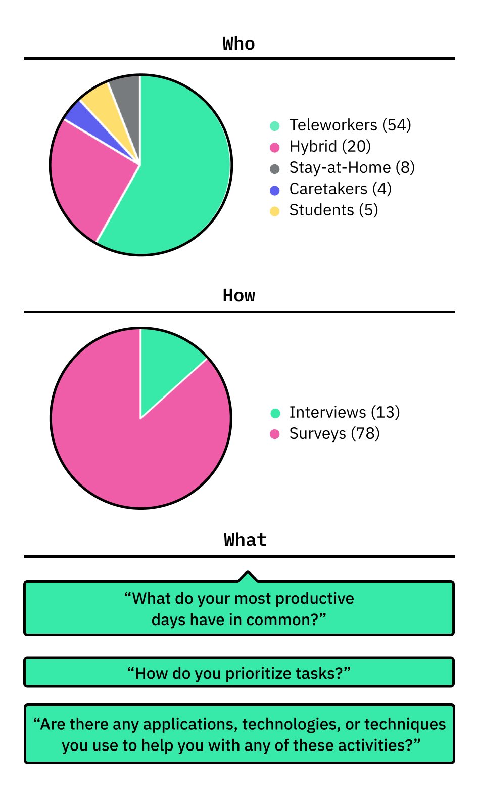
User Interviews
The team divided and conquered to conduct 13 virtual, user interviews over the course of a week. Each teammate was responsible for scheduling, facilitating, notating, and transcribing 3-5 interviews. We all followed 1 of 2 interview script variants I wrote, and were looking for answers to questions like, “What do your most productive days all have in common?” and “How do you prioritize tasks?”. Results of the user interviews made up the majority of our qualitative data and informed our understanding of users’ behaviors and needs.
-
We were really ambitious with our goals for the amount of users we wanted to reach. The team really pulled through by recruiting, conducting , and processing over a dozen interviews in 1 week.
Synthesis
Affinity Mapping
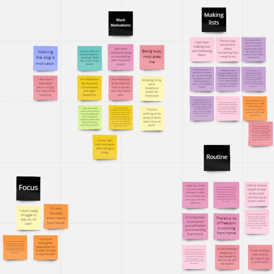
Our research all came together on a digital whiteboard. Each member uploaded snippets from their interviews on sticky notes. As a group, we poured over the notes, arranging them into themed groups. Graphs, statistics, and quotes from the surveys were added to the same board, helping us focus on 3 key themes that were backed by qualitative and quantitative data.
Key Research Insights
3 key insights took shape when synthesizing the user research. Qualitative data is represented by quotes from user interviews and quantitative data is backed by user surveys.
Calendars
Remote workers rely on their digital and physical calendars.
“If it’s not on my calendar, it will not happen. This is true for work and personal.”
92%
survey respondents indicated that they utilized their calendar
Notifications

WFH users have mixed feelings about the use of notifications.
“I eventually silenced my notifications because I felt guilty I was on my phone so much”
75%
of respondents use notifications, but their experience using them isn’t strictly positive
To-do Lists

The to-do list method of organizing tasks has devoted followers.
“I stay motivated while working from home by keeping a list of important things to do for the day and making sure they get done.”
73%
of respondents indicated that they use to-do lists
Design
Workflows

After determining the key features of the design, we used workflows to iron out the steps users would take to complete their tasks. Heidi and I went through many workflow iterations, each time simplifying the amount of screens and steps Lindsey would need to go through. This was an important phase as it aligned team member expectations and enabled us to plan out the interactions that we wanted to prototype and test. We didn’t waste our time later by building out features that were not relevant to the key flows.
Journey Map

Using the Lindsey persona, we mapped out an average day working from home. This includes her goals, tasks, and emotional states along with opportunities for improvement. Mapping out her day helped us narrow down the focus of this project and let us picture how a user would implement our solution in their daily life.
Wireframes

A number of wireframes were sketched and reviewed by the team. We conducted dot voting to identify the design choices that the team liked best and then I sketched out a final round of wireframes with all the winning design choices. Implementing the voting step made sure that every team member’s voice was heard and that everyone had ownership of the solution. We wasted no time getting user feedback enabling us to quickly iterate and improve the solution as digital prototypes were built out.
Wireflows
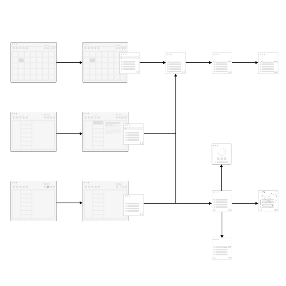
The wireframes and workflows were married together into a wireflow. Seeing all the wireframes strung together all in one place was helpful as we added more detail to our wireframes and prototype. At a glance, we could check what needed to be included to drive the user on the next step and we could take account of the components that were shared across multiple screens of the design.
Storyboard

Similar to the journey map, we wanted to follow Lindsey as she worked from home. Sam created this storyboard, illustrating Lindsey completing a limited number of tasks using our proposed tools and features. Captioned storyboard panels made her story more tangible and enabled us to more effectively share our solution outside of the team because of the digestible imagery and narrative.
Branding

During the later phase of the project, Mateo, our Design Lead, researched and developed a branding guide. This included a mood board, color palette, typography, and a personality. We worked off of this to give all deliverables a cohesive visual language.
Iteration
Prototyping
At least 2 rounds of prototypes were created before landing on the finalized design. With each iteration, we added more content and polished branding to help testers parse the design. This occurred in tandem with user testing. Heidi tested the prototype and communicated her findings to the team meanwhile Mateo updated the prototype accordingly. The process repeated until we had a hi-fidelity prototype.
Low-Fidelity
Question
“What do you think the left panel is showing?”
“Are these the fields you would expect to see for a new to-do item?”
Answer
Confusion about the purpose of the left panel in relation to the center panel
The word “Tasks” already refers to a function in Outlook, testers expected it was the same feature
Application
Place controls, that differ visually from the center panel, on the left side
Re-label “Tasks”
Mid-Fidelity
Question
“How would you add a new item to your to-do list?”
“Do you see a way to move an item from one list to another?”
Answer
Misread to-do list as a view of items on their calendar for today
User mistook the timer for a way to create an audio memo
Application
Label more clearly the day that is featured
Test an alternate timer format
High-Fidelity
Question
“Looking at this screen, what do you think you can do in this app?”
“At the bottom of the right panel, what is that? How do you think you use it?”
Answer
The term “Backlog” is not understood by all
“Helpful files would be…helpful”
Users stumbled to complete tasks by tracking their progress in the right panel
Application
Re-label “Backlog”
Simplify the steps necessary for completing out tasks
User Testing
Six users from our initial round of interviews agreed to participate in user testing. Heidi facilitated 30 minute, virtual tests. Testers were asked to complete 3 tasks and were given the opportunity to share their expectations and thoughts. We received great feedback about what features they liked, didn’t like, and things they would want added. We cut out the features that had confused testers and focused our efforts into strengthening the features they responded positively to. The final iteration was much stronger because of user input.
-
At this point in the project, we really had to divide and conquer to achieve our goals. Team members worked synchronously to update the prototype and run user tests, keeping in constant contact to drive the changes forward.
Using Daylist

Daylist bridges the gap between to-do lists, calendars, and emails through features that span platforms.
We prototyped and tested 3 flows to demonstrate how a user, like Lindsey, would take advantage of Daylist on her typical day working from home. Each flow addresses some of the 3 key research themes: To-Do Lists, Notifications, and Calendars.
An emphasis was placed on “To-Do Lists” given that Lindsey is the “Teleworking List Maker”.
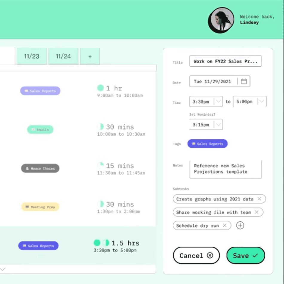
Adding to Your List
New items are added to the to-do including relevant info that can help the user organize and complete their task. A name, date range, reminder alert, and tags are consolidated into one listing.

To-Do Lists: Users are able to break down complex projects into bite-sized to-do’s that have the relevant info all in one place.
Calendars: Users can keep on top of their projects’ timelines by having their digital calendars automatically blocked off for to-do listings.
Crossing it Off Your List

The most important part of using a to-do list is crossing things off the list. In a digestible format, users are presented with the details of the task at hand with tools to track its progress.
To-Do Lists: Users can be more conscious about how they are using their time by using the to-do timer. When they have accomplished their goal, they can mark it complete and move on to the next.
Notifications: If distracted by other tasks, notifications can help users pull focus back to the goals they have set for themselves.
-
Our user research found that people feel satisfied when they are able to physically cross an item off of their to-do list. We wanted to recreate this positive feeling by building in celebratory interactions when the box is ticked. User testers really loved this burst of confetti!
Updating Your List
The to-do list needs to be flexible to keep up with whatever is thrown at the user. Updating a listing is quick and simple, mirroring the process of listing creation.
To-Do Lists: Users are not bound to the list they initially created. They are able to re-work them quickly for continued use.
Calendars: Users calendars are kept up to date when changes are made to the timing of their listings.

See it in Action
Interact with these key features with the Daylist Figma prototype.
Next Steps
Given the short time span for this project, we knew that we were limited in what we could accomplish. We focused on building and testing the core to-do list features and set aside additional features for later phases. If we were to continue on with the Daylist project, here’s how we’d do it.
Immediate Next Steps
Test and Validate
Testing with a higher quantity of users would give more validity to our solution and reveal user insights that were not uncovered with our limited testing pool.
Refine Interactions
The Daylist prototype includes lots of micro interactions and we had to prioritize. With further design and testing we would ensure that these interactions were refined.
Daylist as a Plugin
As a team, we imagined Daylist integrating with established email clients and productivity tools. In a hypothetical stage 2 of this project, we would build out how that might look.
Future Vision
Device Integration
Our user interviews revealed that users like to hand write notes. Using digital notebooks, we could explore how users could write out their to-do’s and see them automatically added to their desktop app.
Performance Feedback
Adding analytics so users can see how they are spending their time according and how well they are sticking to their target time goals.
Joining the Google Family
In the future we could see Daylist join a larger app suite, like the Google family. By integrating with Gmail and Google Calendar, users would have a one stop shop for planning and executing their to-do’s.
Reflections & Learning
In retrospect, there are some things I would do differently if I could, however, most of our work I am extremely happy with. This was my favorite project of my UX Master’s program!
Additional Personas
We only created the one persona of Lindsey, having a second or third would have represented the breadth of our user research better.
Alternate Journey Map
The journey map was helpful to envision how Lindsey could use the solution throughout her day, but because we had created it with our feature in mind, I wonder what insights we could have gained by creating it earlier in the process.
The Feature Presentation
Our advisor Patricia passed on invaluable knowledge for crafting a case study. I did a bulk of the work on planning out the content, Heidi cut out the clutter, and Mateo made it beautiful. I hold all my following presentations to the standards we set.
Being the Project Manager
As the Project Manager, I knew that I was responsible for the success of our team in addition to my share of the work. Communication was key as we worked together virtually. I led our meetings and, using voting and postmortem exercises, gave all members the opportunity to voice their ideas. To mitigate confusion over all the moving parts, I kept a running record of each week’s goals and each member’s responsibilities. At the conclusion of our class, our case study presentation received the highest marks possible and the team disbanded on good terms (which is rare in group projects).