WorkCurrent
Getting employees up to speed with what they are doing and who they are doing it with.
Some Context
Roles & Contributions:
Everything: Project Manager, Research Lead, UI Designer
Research Categories:
Generative, Evaluative
Project Timeline:
15 weeks
Project Type:
Capstone project, M.P.S. UX Design program from MICA
Faculty Advisors:
Arkadiy Avrorov, Logan Perez
High-Level Research Goals
Learn about the macro forces affecting employee retention and organizational goals.
Understand an employee's goals, motivations, and challenges when adjusting to a new role.
Validate a proposed solution by testing with users to understand if it is a tool they can use and would implement.
The Challenge
In the wake of the Great Resignation, it's in employers' best interest to give new employees positive onboarding experiences in order to improve retention years down the road. In organizations with large work forces or with mixed WFH schedules, onboarding employees face challenges learning the ropes of their new position while getting up to speed with the office ecosystem. An onboarding employee needs to be set up for success by their organization.
Problem Statement
Employees starting a new role need resources to supplement their training so they can self service questions they may have about what they are doing and who they are doing it with.
In Real Life
One day, while working in office, 2 co-workers I had never been acquainted with wandered up to my desk sheepishly. Their arms were overflowing with products and they had bewildered expressions on their faces. They had a sequence of questions: Who does photography? Are they in today? Where is their desk? Which request form do I fill out? Where can I find that link?
With this project, I wanted to create a solution that would help employees who have lots of questions about how things work in the office.
The Users
Personas
User personas, based off of user interviews, were important for giving a face to the end user. I created 2 personas, including a title, short bio, demographics, goals, tasks, pain points, and an image. They kept me centered on the users and not my own perspective. Personas were utilized later in the process as the subjects of journey maps and as the user featured in the hi-fi prototype scenario.
Frances
The Mid-Career Climber
LOGISTICS MANAGER
INTERNAL HIRE
IN-OFFICE 100%
Goals
Get up to speed with his new team
To understand what he's doing and why
To quickly get started on his work, with autonomy
Tasks
Setting up intro meetings with team
Finding relevant documents and resources
Passing on info to his old team
Prioritizing new responsibilities
Jess
The Nervous Newbie
CONTENT DEVELOPER
EXTERNAL HIRE
REMOTE 50%
Goals
Get up to speed quickly
Fit in and overcome imposter syndrome
Learn from co-workers
Understand what her work contributes towards
Tasks
Asking questions about her role
On the job training
Learning who her co-workers are
Onboarding paperwork
Finding her way around the office
Generative Research
Mind Mapping
I kicked off this project by sketching out a mind map of the problem space, including the potential users, stakeholders, goals, and assumptions. This visualization of the inter-connected factors helped me identify what I already knew coming into this project as well as where to start my research.
Stakeholder Interviews
I needed to find out employers' perspectives on the issues surrounding onboarding, so I went right to the source. Talking with HR and IT professionals revealed obstacles that would prevent implementation of onboarding solutions and gave me an understanding of an organization’s goals. These conversations with subject matter experts helped me develop constraints to follow throughout the project.
Desk Research
I looked to at 2 peer reviewed journals, 6 articles published for Human Resources professionals, and “The Employee Experience Advantage”, by Jacob Morgan.
Conducting this research helped me understand the state of Employee Experience with new employee onboarding. These resources, however, come from the perspective of employers and under-represented the points of view of the target users.
User Surveys
Next I conducted a user survey to get quantitative insights on common onboarding experiences new employees have. I received 11 responses to the Google Forms survey I shared with my network.
With the small sample size, there was no strong consensus however, a many indicated that they would have changed a lot about their initial onboarding plan. I knew this is something I would have to probe during interviews.
User Interviews
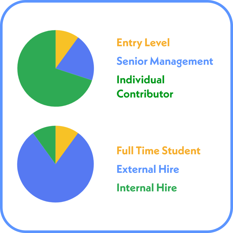
Over the course of a week, I conducted 8 virtual user interviews with employees 0-6 months into a new position. My goal was to learn the methods that were used with their onboarding, how well they were prepared for entering their new role, and how they felt about their experience
Talking directly with users gave me the ability to dig deeper into their experiences and what they meant to users. These interviews were invaluable to understanding user needs and it was one of the highlights of this project.
Competitor Analysis
Before I could approach a solutions, I needed a better understanding of what products and services are already available. I researched and tested samples of at least 7 employee experience tools. Using matrices, I plotted how well they would accomplish user story prompts.
For a qualitative understanding, I asked 2 users to give me a tour of their Haystack and Microsoft Share Point work accounts. These tours showed me the competitors tools in action as well as users' attitudes and motivations while using the product.
-
In retrospect I wish I could have run a second survey that was more specific to the key findings later on for quantitative support.
Synthesis
Affinity Mapping
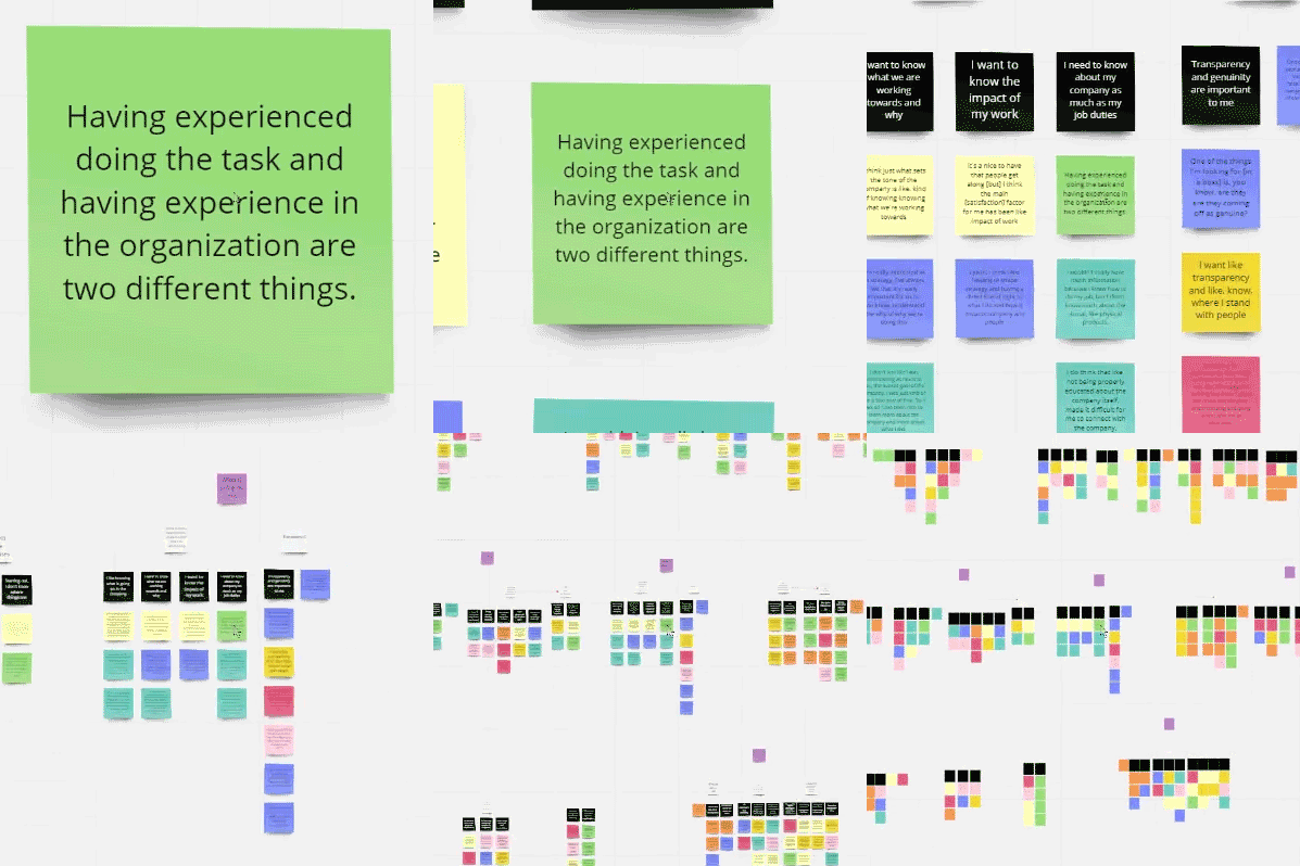
From all 8 user interviews, I pulled out digestible snippets that revealed something about the users' motivations, attitudes, and behaviors. Using a digital whiteboard platform, I arranged these anonymized morsels of information into groups of 2-5, titled the group, and repeated. Over 280 sticky notes were narrowed down to a handful of key insights.
Journey Mapping
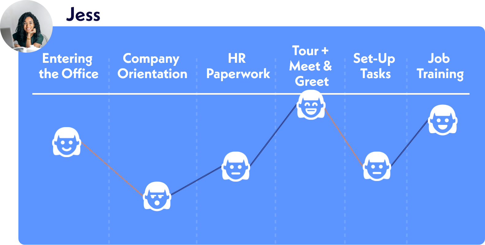
During interviews, users detailed their first few days on the job and how they felt about it. I used these stories to plot a journey map following 2 personas on their first day of work. These maps included their tasks, pain points, and emotional states along with opportunities for improvement. Mapping out these experiences helped me narrow down the focus of this project. There were a lot of problems that I could have fixed, but I only had to target the ones that had the most extreme and long lasting negative effects on the user.
Key Research Insights
4 key insights took shape when synthesizing the user research. Each quote was voiced by a user during interviews.
Reference Resources
Employees benefit from having informational resources that they can easily reference as needed.
"I'm a person of structure. I like having more information, whether I needed it or not, but something to reference."Question Hesitancy
Employees feel like they should know the answer to the question or be able to figure it out themselves.
"I do have like a hesitancy to ask questions, unless I'm desperate."Building Connections
It's difficult to build rapport with co-workers if you aren't seeing them everyday or don't know much about them.
"It felt really hard to communicate with them because I just felt like I didn't know them."The Big Picture
Employees value seeing how their work contributes to the overall organization.
"You really get to see everything that's going on. And you're like, 'Wow, I'm working on this smaller part of things, but it connects to all this stuff that's going on!'"Design
Workflows
Determining the key features was the most challenging part of this project and workflows were indispensable to stepping through potential solutions. I went through many variations mapping out 3 tasks that users could complete with the prototype as well as the paths they would follow to complete them. Visualizing potential solutions step-by-step allowed me to hone in on the most effective features.
Branding
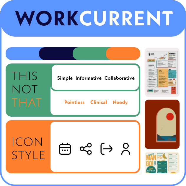
While I prototyped and tested, I created a branding guide to give all deliverables a cohesive visual language. I built out a mood board to define the brand's visual language, generated a color palette, established typography, and gave it a personality. With cool, contrasting colors and smooth shapes, WorkCurrent’s brand identity is simple, informative, and fun.
Iteration
Wireframing
I roughed out screen designs with hand-drawn wireframes. Being scrappy in this phase let me visualize a number of designs in a short period of time. These sketches were presented to a user tester in order to get feedback on the general concept before moving in to prototyping. They validated my concept and pointed out things that needed to be improved before showing to other testers.
Prototyping
At least 3 rounds of prototypes were created before landing on the finalized design. I tested each iterations with multiple users, identifying features that they liked and disliked. Strengths were emphasized and weaknesses cut. More content and polished branding were included as the design came together to help testers parse the design. I added an additional challenge to myself by only using Adobe XD, a tool I had less experience with.
Low-Fidelity
Project goal
Office schedule
Employee profile
Co-worker's task list
Collaborative
Clarification request
Mid-Fidelity
Visual work flow
External partners
Employee contact
Comment sections
Co-worker view bar
Stand alone product
High-Fidelity
Project goal
Stage preview bar
Plain language details
Question board
Office schedule
Verbiage
User Testing
-
Mid-fidelity tests had me panicked. It seemed that no users were interested in this solution. My advisors Arkadiy and Logan encouraged me to simplify my design, focusing the parts that users liked. The next round of testers reacted more positively to the design. Crisis averted!
Overall I moderated nine virtual user tests. I asked testers to complete certain tasks, explain to me how they interpreted the designs, and how they felt while using it. Testers gave me great feedback about what features they liked, didn’t like, and things they would want added. So many of my assumptions were disproved during this time. One of my key features was completely abandoned because it was not something that users would implement. My design was challenged and improved far beyond what I could have accomplished by working in a vacuum.
Using WorkCurrent
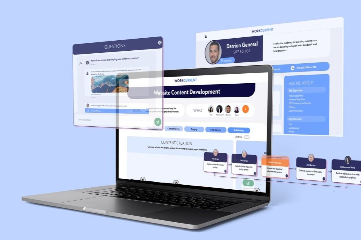
WorkCurrent is an employee experience platform that focuses on giving employees access to information about the general work structure of their organization.
Francis would use it move internally within the organization by learning about the other teams’ workflows and team makeup. Jess would reference the workflow to gain more confidence that she knows what she’s doing while she is settling in.
A handful of features were developed and user tested to address the four key research findings: Reference Resources, Question Hesitancy, Building Connections, and The Big Picture.
Visual Workflow
Recurring projects are presented as visually digestible workflows. Each project is broken into it’s most basic steps, paired with the employee(s) who champion it, and arranged sequentially.
Reference Resources: Employees can reference these workflows to fill in the blanks themselves without document-hunting or guessing.
The Big Picture: Employees have a better sense for what their work contributes to, seeing the tasks later in the flow that are reliant on their contribution.
Question Board
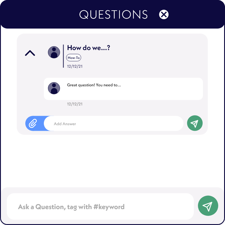
Tied to each task is a question board where users can find FAQs related to the task or post questions for their co-workers to answer.
Question Hesitancy: Employees have a space where they are encouraged to ask questions and can see that they are not alone in their confusion.
Reference Resources: Employees know they can check the question boards for an answer instead of digging through inboxes or files.
-
This feature surprised me the most. It was removed in the middle rounds of testing after negative feedback. The following round of testers missed having a place for questions so it was brought back.
Employee Profile
Information about all employees is readily available. Employee profile pages are a one-stop-shop for getting basic information on a fellow co-worker.
Building Connections: Employees have less barriers to getting into contact and finding common-ground with their teammates.
The Big Picture: Employees get a sneak peak into the work and expertise that is championed by their peers, anywhere in the organization.
See it in Action
Interact with the WorkCurrent high-fidelity prototype featuring Jess as the user!
Next Steps
Only a few features and workflows were able to be prototyped over the course of this project. I I were to continue, I would start by building out the other features of the WorkCurrent platform, such as creating a new project flow.
Alternatively, because there are so many competitor products on the market, I would explore what it would look like to apply the strongest features of WorkCurrent to an already established workforce management platform. We don’t need more solutions, we need better ones.
Expanded Features
and Content
Onboarding checklist
Question tag search
Tutorial mode
Workflow building
Further User Testing
Fresh participants
Test for ease of use
Implementing with Existing Product
Identify compatible product
Rebrand to match
Prototype and test
Reflections & Learning
This project challenged me to question my assumptions and take into account the context that surrounds the problem space. I had to consider how to stand out amid a sea of competitors, take into account the stakeholders outside of my target user group, and balance functionality with ease of use.
Working as a team of one gave me the opportunity to sharpen my skills in multiple roles. As the Project Manager, I developed and executed the project plan in a timely manner. As the Research Lead, I talked directly with users and interpreted the information they shared. As the Design Lead, I utilized my mastery of industry standard design tools to build polished deliverables.
Market Saturation
An abundance of tools for employee engagement and onboarding makes it difficult to stand out and appeal to users.
Platform Maintenance
The success of this solution depends on information being kept to date and the willingness of stakeholders to adopt and maintain it.
Technical Training
New employees should be able to pick this up without training, but users needed clarification about the proposed solution.


