
E-Newsletter Redesign
Redesigning the monthly Victor e-newsletter to look and perform better.
Some Context
Roles & Contributions:
Digital Designer, Researcher, Developer
Business Affiliate:
Woodstream Corporation
Collaborators & Stakeholders:
Digital Marketing Manager, Digital Design Manager, Creative Director
Jargon:
Promotional email: A custom-designed email message that is highly-visual and features specific products or promotions
E-newsletter: A reusable email design that features auto-generated product and article recommendations from our site
The Challenge
Re-Brand
Throughout 2023, Victor Pest has undergone a rebrand. All consumer facing materials need to be updated to reflect our new look and messaging.
While we are starting from scratch, I took it upon myself to dive deeper into how they could be improved to drive more sales.
Business Goal
The main goal of the e-newsletter was to drive direct to consumer sales through the Victor e-commerce site.
Email Medium
Email campaigns are a primary channel for reaching consumers but building promotional email campaigns takes up a lot of time. Creating plug-and-play e-newsletters, using existing content pulled in by our email platform, frees up team members' time to work on other projects while continuing to engage email subscribers.

Constraints and Limitations
Plug-and-Play
My final deliverable needs to be an HTML template that the email specialist can schedule out monthly. They will not be making updates to ads or paragraphs of content, all content will be pulled in from the site automatically.
Structure
The content pulled automatically from the site comes in PNG form, there is no way to refine image dimensions or text styling. My design needs to account for this variability.
Previous Performance
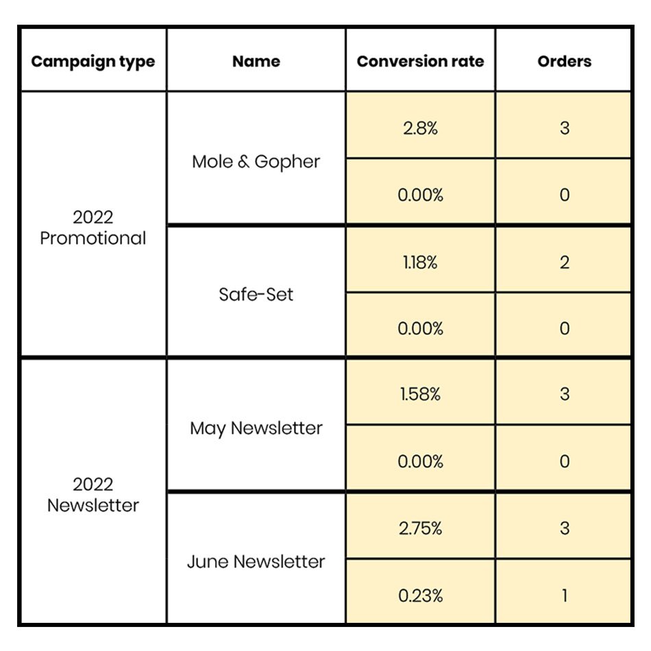
I looked at the analytics for both promotional and e-newsletter email campaigns that were active before we undertook the rebrand. I needed to find out what was working and what wasn’t.
Sales and Conversions
Why?
I’m paying attention to the orders and conversion rates of previous emails because driving sales is the primary goal. I can measure the success of the re-design based on how it compares to the previous design’s sales.
Take-Aways
Newsletters performed on par with promotional campaigns in terms of orders and revenue. They are low effort but yield big results, an easy way to bring in revenue.
The goal of the new design will be to receive approximately a 2.00% conversion rate with 3 sales per monthly campaign.
Note: This data is from a comparison of 2 promotional and 2 e-news campaigns, all sent to multiple contact lists within a 2 month period. Actual money amounts have been excluded for privacy.
Heat Maps
Why?
Our email platform provides heatmaps for each campaign, it’s effortless quantitative data!
Reviewing the maps give a visual way to track how users interact with the message. Paired with the conversion rate, we can make assumptions about how integral each interactive element is towards achieving our goal.
Note: The following are select content blocks representative of 5+ newsletter campaigns sent during 2022.
Header

Heat map indicates a medium amount of clicks, with a healthy percentage of the message’s conversion rate, when people click on this, they are likely to shop.
This links to the Victor homepage, and with a 20% conversion rate, looks like users were successfully completing transactions, starting at Home.
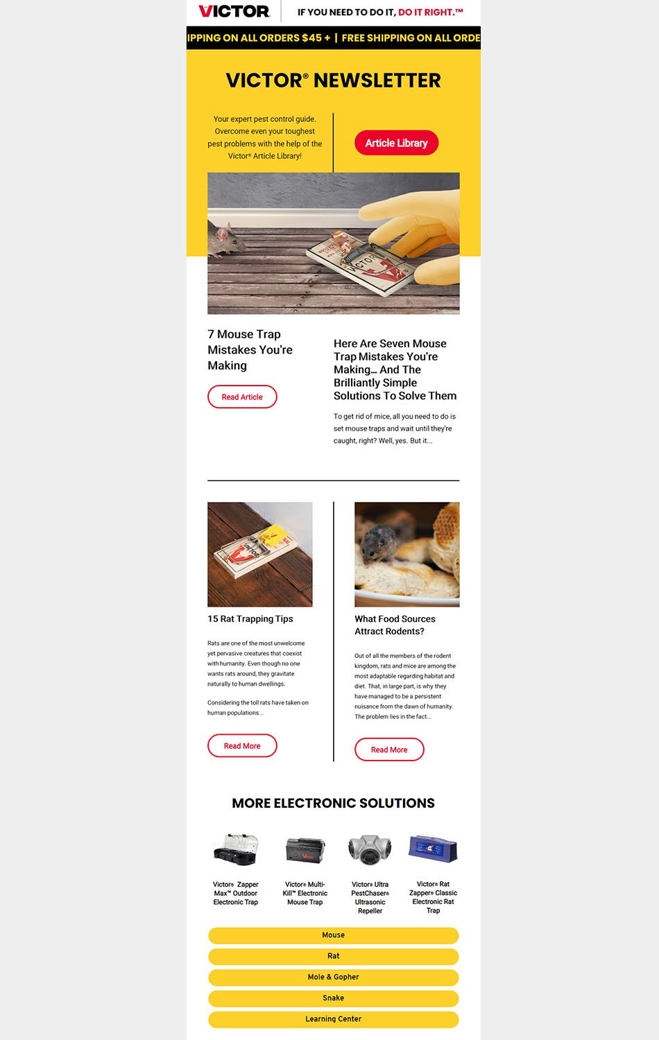
New Design
Should keep attention grabbing heading
Would linking it to the store page affect
the conversion rate?
Article Previews

The article CTA is one of the hottest interactions, but has little to no conversions. People who use the CTA are not following through with a purchase.
New Design
Should keep CTAs
Are article pages giving an easy avenue for users to start shopping?
Product Recommender
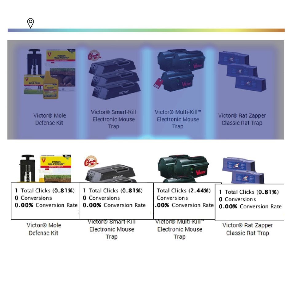
Users are not interacting with or making purchases from the product recommender.
This block, in this form, could probably be removed and revenue would not be affected.
New Design
Experiment with different forms of product features: a single product recommendation, “Our newest innovation”, tying a product to an article.
Are automatic recommendations effective?
Are there too many products being featured?
Animal Categories
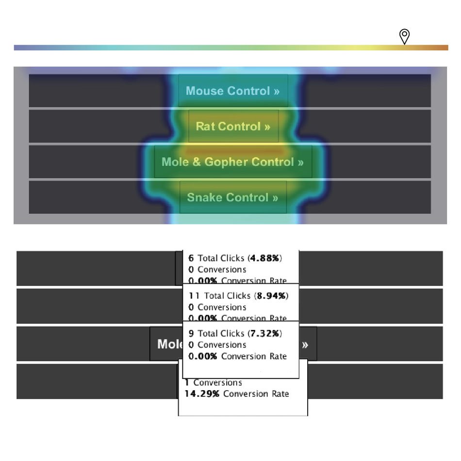
The categories are highly interacted with and will consistently have more conversions than product CTAs. People start their shopping process by identifying their pest problem.
Links lead to Category pages where they can look at a page of products to choose from. Users want to choose from a list of products that are relevant to their problem pest.
New Design
Needs to keep the same category block.
Should include other ways to shop by pest.
Should pest categories be included earlier in the message?
Should emails be seasonally specific to pest categories?
Comparative Analysis
Before jumping into designing, it’s important to look at what other marketers are doing with their emails. Even though these are not direct competitors, it’s important to pay attention to what other industries are doing because our consumers may be interacting with their brands more frequently so they are setting the tone for the audience's expectations.
Lightning Demos
Why?
Finding inspiration is always helpful, but it’s easy to fall into the trap of copying directly from the original design. I wanted to make sure I was paying attention to the overall structure by sketching out the designs’ wireframes.
KitchenAid

Likes
Holiday theme
Product tied to each recipe
Content short and sweet
Dislikes
Not plug-and-play friendly
New Design
Should keep attention grabbing heading
LS Graphics

Likes
Alternate content block layouts
Low contrast bounding boxes
Text formatting
Dislikes
Weak brand identity
New Design
Two kinds of content blocks
Inject brand identity throughout with color and imagery
Hodinkee
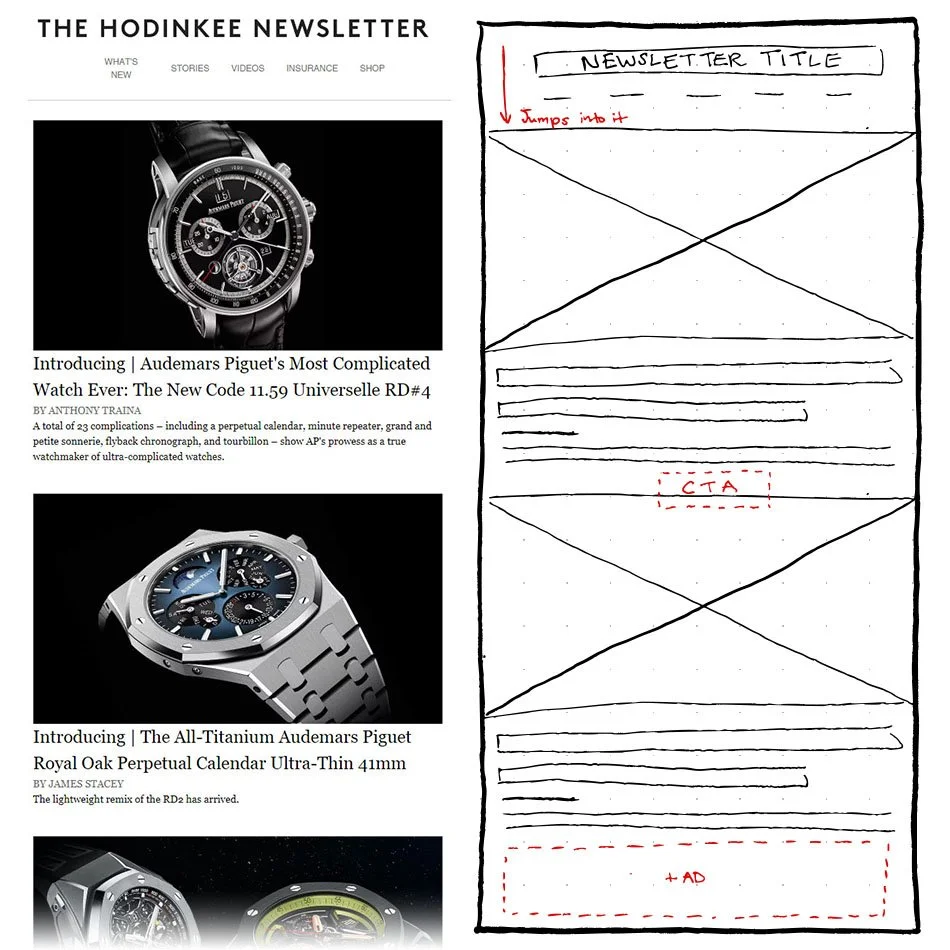
Likes
Classic newspaper feel thanks to fonts
Jumps right into articles
Dislikes
Photography reads more like ads. The ad at the bottom blends in
Missing a strong CTA
New Design
Should keep attention grabbing heading
Design
Round One
Prototyping
Likes
Gridded layout
Full-width image
Dislikes
Side-by-side content
Article link up top
New Design
Brief, typographic header with CTA
Strong grid layout
Break up resources with product recommendations
Alternate image placement (left or right) down the page
Solid yellow backgrounds
Minimal written content
-
I had done a round of design before jumping into the above research. When it was time to revise my initial design, I felt directionless and uninformed on what would make the design more successful. I launched into research to find answers and to help me make informed decisions.
Round Two
Crazy 8 Sketching

Why?
Sketching out multiple versions got the creative juices flowing and helped me push past my initial ideas.
New Design
CTA in hero can go
Use of large imagery
Strong use of grid
Not reliant on text boxes being top aligned to each other
Prototyping
HTML prototypes with placeholder content to apply what I learned in the research and previous design phases.
Design Includes
Attention grabbing heading
A strong grid layout
Resources broken up with product recommendations
Two kinds of content blocks
Alternate image subject placement down the page
Minimal written content
Brand identity injected with brand color and imagery
Next Steps
Currently this project is ongoing. The design will be reviewed by stakeholders and further refined. It is not within the scope of this project to conduct user testing, but I plan on showing the prototype with collaborators and watching as they see the message for the first time for their initial insights.
Further UX Research
Reviewing the previous e-newsletter analytics brought up questions pertaining to the performance of our site as an ecommerce platform.
These are questions that should be followed up with further research in order to identify possible weaknesses in our online shopping experience.
I would prioritize the first research question because according to HotJar and Google Analytics, the page on our site with the most traffic is an article page. If we are receiving a lot of traffic, but aren’t providing an easy way for consumers to continue on to a purchase, then we are failing to meet our primary goal of driving ecommerce sales.